
A Shepherd in Combat Boots
A Shepherd in Combat Boots is a museum map that traces Chaplain Emil Kapaun's path across the Korean Peninsula, from his landing at Pohang in July 1950 to his death at Pyoktong POW Camp 5 in May 1951. It hangs framed in a small museum honoring the Medal of Honor recipient, now on the path to sainthood. The project also produced a pocket tri-fold brochure and a Czech-language edition for Kapaun's Czech heritage community.
Project Lead: McNaught Design
Client: Catholic Diocese of Witchita
Location: Korean Peninsula, 1950
Platform: Print
The final map showing Emil Kapaun’s journey across the Korean Peninsula.
The Challenge
The museum needed one map that a visitor could take in at a glance yet keep reading for ten minutes. Most Korean War maps try to cover all three years of the war and become hard to follow. This one had to tell a single man's story while still showing the troop movements, front lines and terrain that shaped it.
The brief came with rich source material: ten key locations, dates, a detailed Genially presentation and a handful of archival photographs. The design task was to make all of it readable together, at museum scale, without losing the human story under the military history.
Research & Data
Father Emil Kapaun grew up on a farm in Pilsen, Kansas, the son of Czech immigrants, and was ordained a priest for the Diocese of Wichita in 1940. After serving as an Army chaplain in World War II, he returned to uniform and deployed to Korea with the 1st Cavalry Division in 1950. Captured after the Battle of Unsan, he cared for fellow prisoners until he died at Pyoktong POW Camp 5 on May 23, 1951. He was awarded the Medal of Honor in 2013 and is now honored by the Catholic Church as Venerable.
In order to tell his story during the Korean War, McNaught Design set up a shared Google Earth project so the client could pin each event directly on the map, with dates and notes attached. That gave us one source of truth, and we pulled those points straight into GIS for production.
Alongside the client's ten locations, we researched the wider campaign from July 1950 to May 1951 and mapped it as context layers:
UN and North Korean (NKPA) advances, and the Chinese entry into the war
The shifting front line and the present-day truce line
Major battles, marked by which side won
Capital cities and the 38th parallel
The result is a hyper-detailed base: every pin sits on researched geography, and the story follows Kapaun's route across the country.
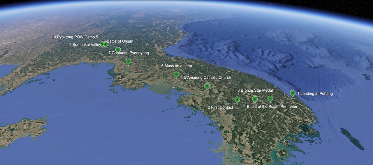
Google Earth was used to work collaboratively with the client and build a history of the Father Emil Kapaun’s time in the war.
Design Approach: The War Table
The map is styled like a commander's war table or a bulletin board in a field tent. Photographs, notes and medals look taped and pinned straight onto an aged paper map. That framing lets archival material sit on the map itself, so a visitor sees the place and the moment together.
Terrain first. A custom built, shaded-relief base map shows the mountainous ground Kapaun's unit fought across. A graticule and muted paper texture give it a period feel.
Photos where they happened. Images like the bicycle Kapaun used to reach his men, the Mass on a Jeep and POW Camp 5 sit beside their numbered stops. Handwritten captions read like notes from the field.
His own words. A pinned excerpt from Kapaun's August 1950 letter and a tribute from Captain Robert Burke bring in first-person voices.
Honors in context. The Bronze Star and Medal of Honor appear next to the events that earned them.
A clear story line. Ten numbered markers and a single route color carry the narrative. Military movements use a separate, quieter symbol set explained in the legend.
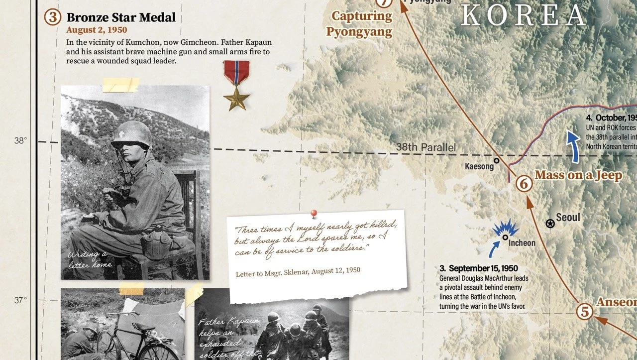
The map was styled to look like items arranged on a wall or table.
Designing For The Visitor
Kapaun's route runs from the bottom right of the peninsula to the top left, against the way people read. During review, the client asked whether the text should follow the route instead.
We kept the story reading top to bottom, left to right. A visitor first takes in the title and the shape of Korea, glances at the photos, then returns to the title to start reading. Placing the legend and event 1 right there gives them an obvious starting point, and each numbered blurb ties cleanly to its number on the map. The layout also matches how guests move through the rest of the museum's exhibits.
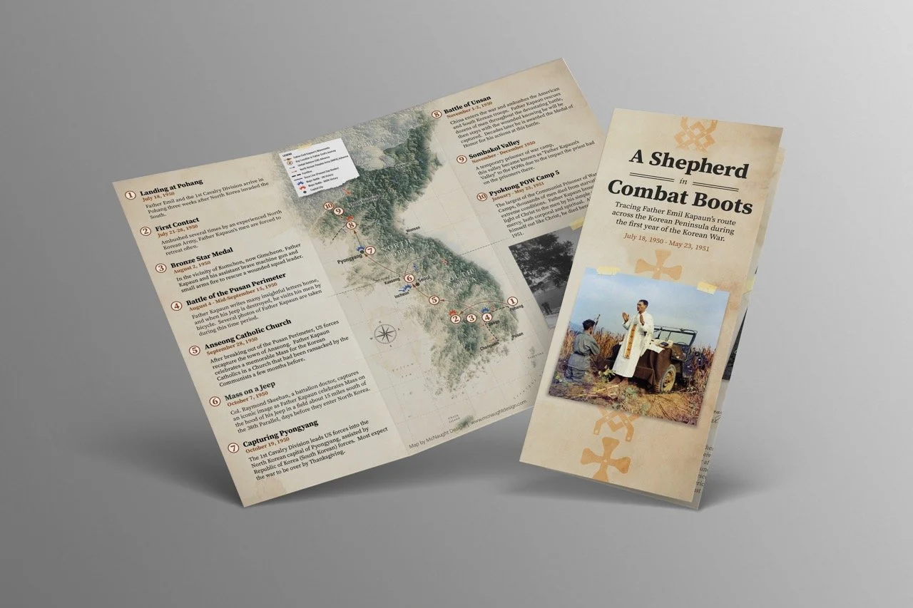
The final trifold brochure version of the map.
Deliverables
Museum Map
24" × 36" print, framed
Centerpiece exhibit for museum visitors
Tri-fold Brochure
Letter-size, folded
A take-home version with the same ten stops, photos and a timeline of the war
The brochure reworks the poster rather than shrinking it: the map spreads across the inside panels and the story wraps around it.
Czech Edition
24" × 36" print
The full map translated into Czech, shared with the client's Czech partners
For the Czech edition, we sourced a professional translator and re-set the text so the layout held up in the new language
The Outcome
Father Kapaun's story is hard to tell in words alone. It spans ten months, hundreds of miles and a front line that swept up and down the peninsula. A timeline lists the dates; a map shows why they mattered: the mountains his unit crossed, how far north the UN pushed before China entered, and how close Unsan sat to the camps where he died.
By layering his route over the armies moving around him, the map turns a complex campaign into a story a visitor can follow with a finger. Ten numbered stops, archival photographs and his own words tie each place to a moment in his life. From across the room it reads as one striking image; up close, it reveals the full arc of his service.
Have a story that belongs on a map? Get in touch.